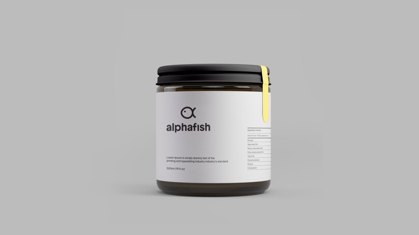
Brand identity design displaying perky and symbolic look for an international fish-based products brand.
With an international business network based in Oman, Alpha Fish is a brand that dedicates to deliver finest quality fish-based products to customers all across the globe. To establish and expand the brand in the global scene, Yara’s design direction was to go for a style which was playful and at the same time embodying an international feel to it.
The verbal prompts given by the brand name was used as the foundation to create the logo. The iconography combined the shape of the Greek alphabet, alpha, with the outline of a fish in one bold symbol. This perceptible play on words and shapes makes the brand more appealing to the mass as it arises a sense of curiosity when seen. The font used to depict the brand name goes along harmoniously with this icon due to its effortless style.
Paying homage to the product and its origin, the colour scheme used for this new brand identity is a vivid and vibrant palette of sea-blue and white, extending the look to a cosmopolitan level class. Not too loud, not too bland, just perfectly balanced – that’s what this classic colour combo shouts out to the viewer.


