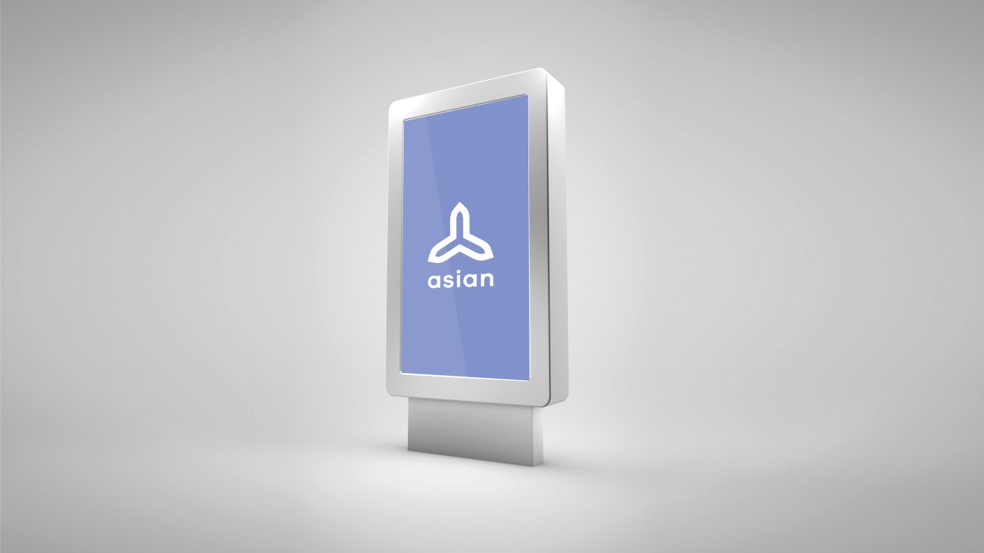
Tranquillity inducing identity design for a prominent healthcare brand.
Optimizing the field of healthcare through the expertise of a skilled and well-trained team, Asian Polyclinic is a medical abode to be recognized and applauded.
Considering the three main elements of health and wellness - physical, mental and spiritual, the identity for this brand is a union of three diverging axes representing these factors. A soft, round lowercase letter style is used here for a visually pleasing look. Adding a pastel shade of lavender and white, the entire design looks tranquil and delicate, conveying the calm, welcoming atmosphere of the brand.
This design is entirely different from the traditional healthcare brand identities in all aspects of icon design, typography and colour scheme, making the brand more visible and distinguishable.


