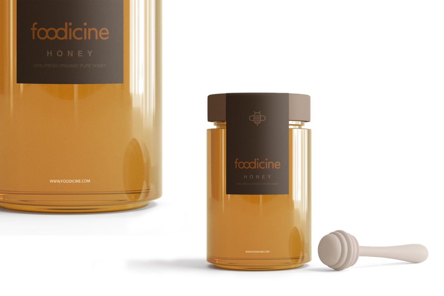
Fresh and bold identity redesign for a healthy, green food supplement brand.
Foodicine is a health and wellness food supplement brand that advocates for a greener, healthier and nutrition filled lifestyle. Yara’s rebranding for Foodicine stems from the thought process of rewiring consumer’s tendency in associating health supplements to a humdrum routine.
Studying the images of various brands in this sector, it came to our attention that majority of the brands are packaged in boxes or wrapping loaded with shapes and pictures while numerous types of fonts are plastered onto it, indicating the various benefits of the product. Our concept for the brand was to come up with a bright, evoking identity design breaking the usual patterns of utilizing health product icons and images by similar brands.
The typography icon designed for Foodicine merges the three alphabets O, O and D in an immaculate yet lively style. To be very well distinct and eye-catching, the typography is wrapped in a vibrant neon-green colour inspired by the natural elements used in the product, making the new logo impactful with minimal visual tricks. Since the brand offers a huge range of products with diverse packaging, this logo style easily adapts with any product package and can be converted to achromatic print versions without a compromise in its individuality.


