Rebranding with a playful package design for a widely used frozen fruit blend base.
Numerous ice cream brands and cold beverage serving food hubs use frozen fruit blends as a base for their products. Truefroot is such a brand with their all-natural fruit blends being a staple for the creation of frozen and cold brew products. For their products to be exported in a wider canvas, the brand approached our team to come up with an entirely different identity, including a new name, for Truefroot.
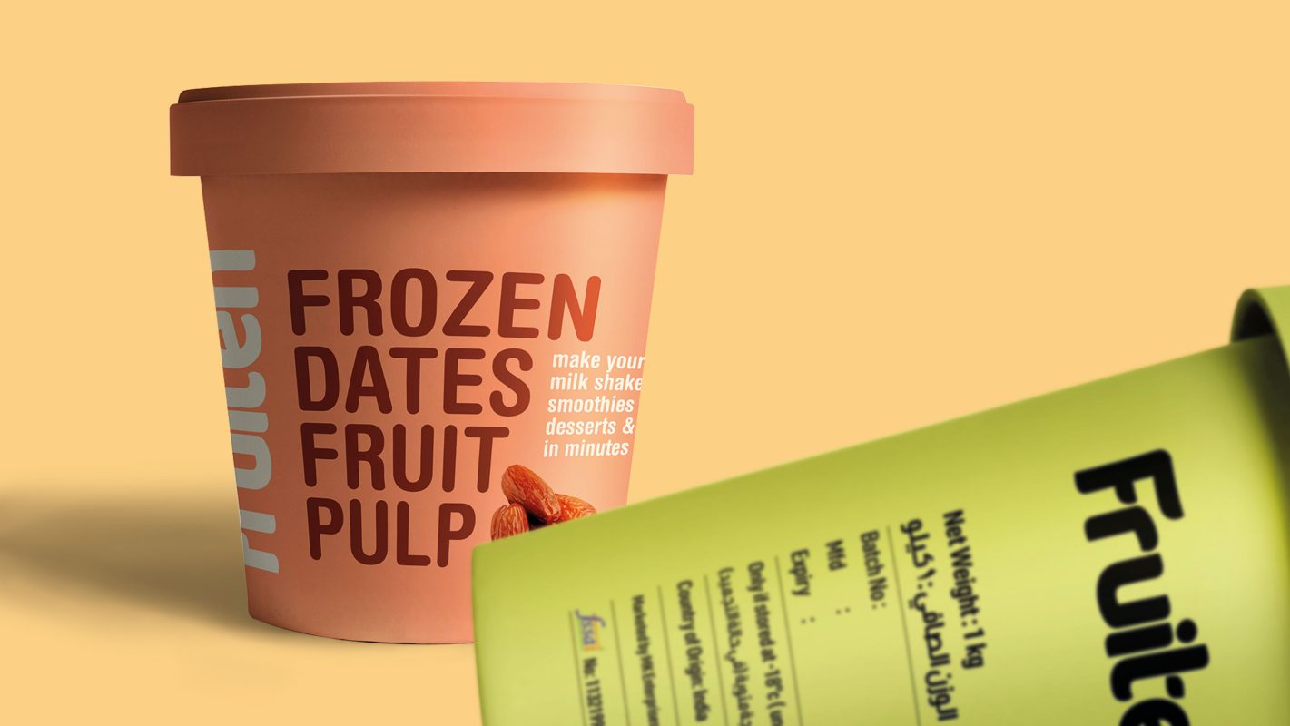
With various permutations and combinations applied, a name that blends the terms fruit and frozen was constructed for the brand, thus rechristening it as Fruiten. This name is a subtle nod to the product made fully out of fruit. Emphasis given while pronunciation makes the name even stronger, describing the fruitiness flavour of the blend when mixed and served.
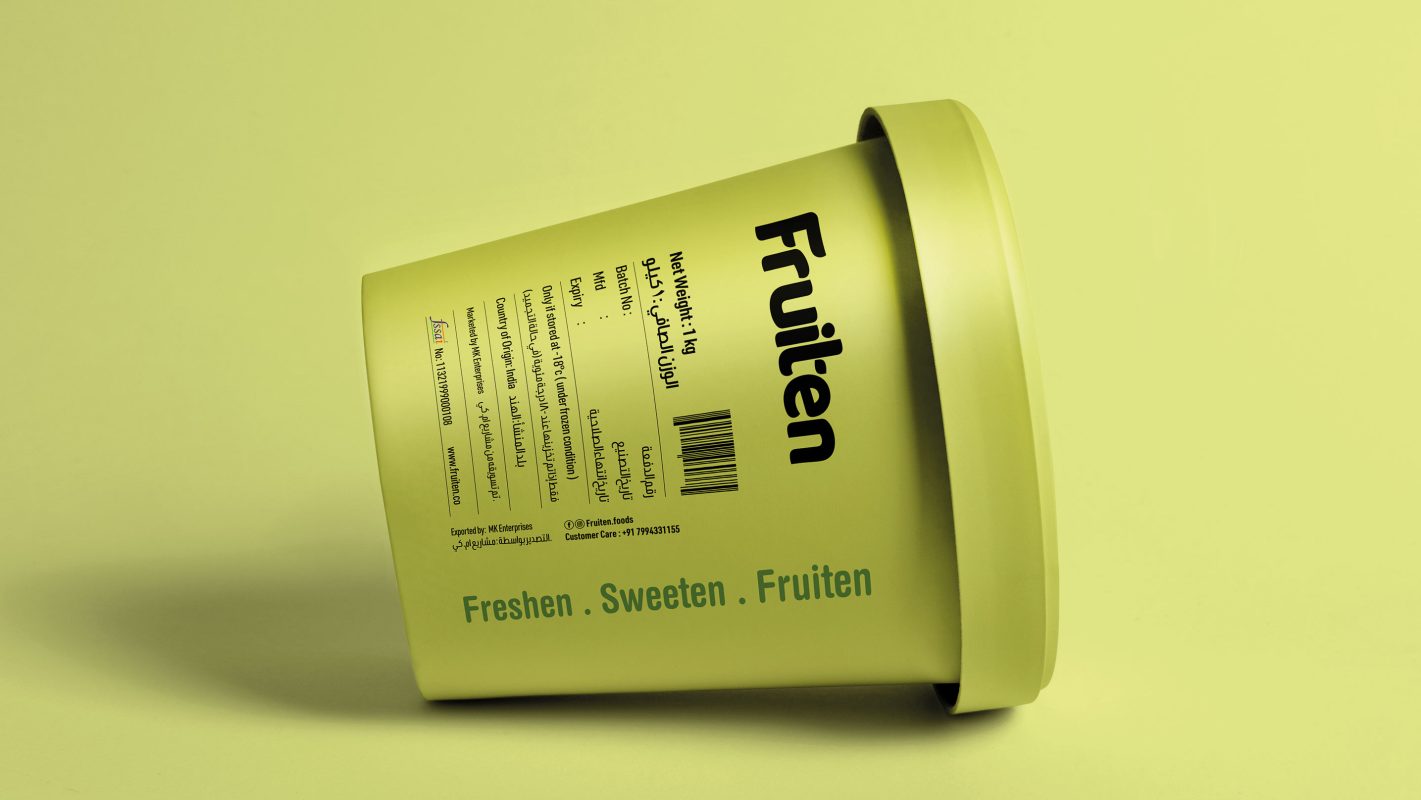
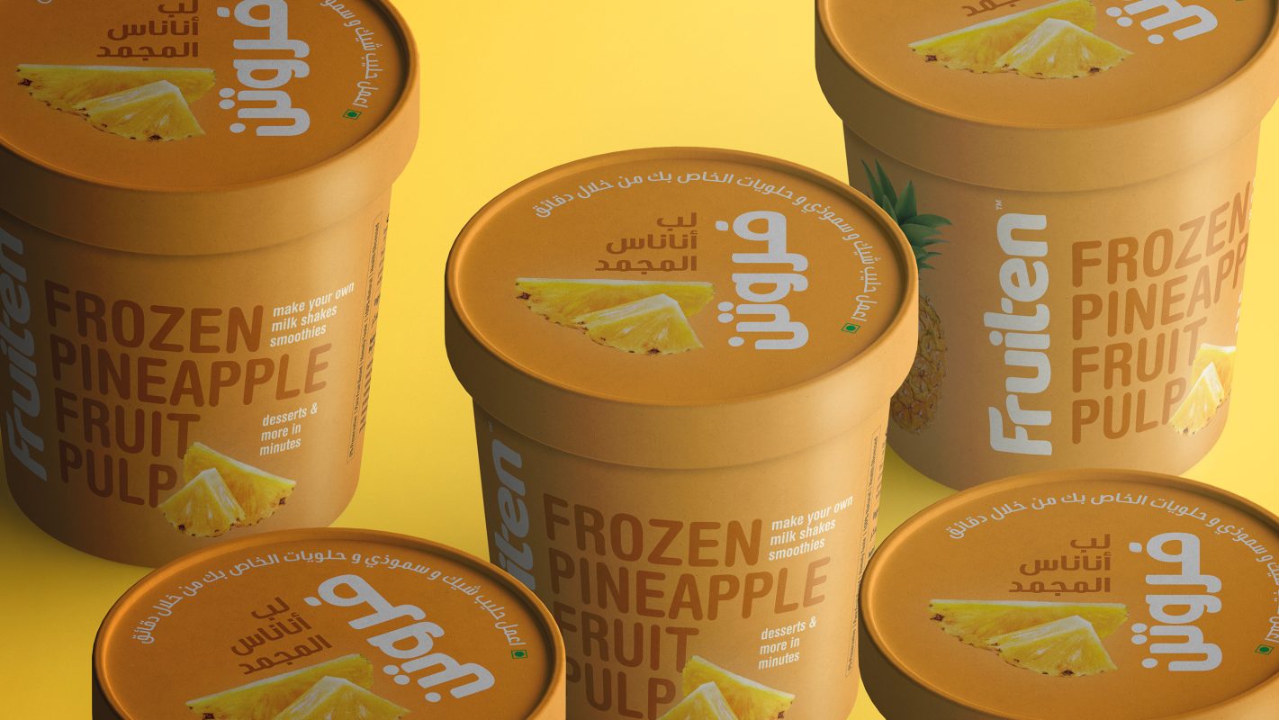
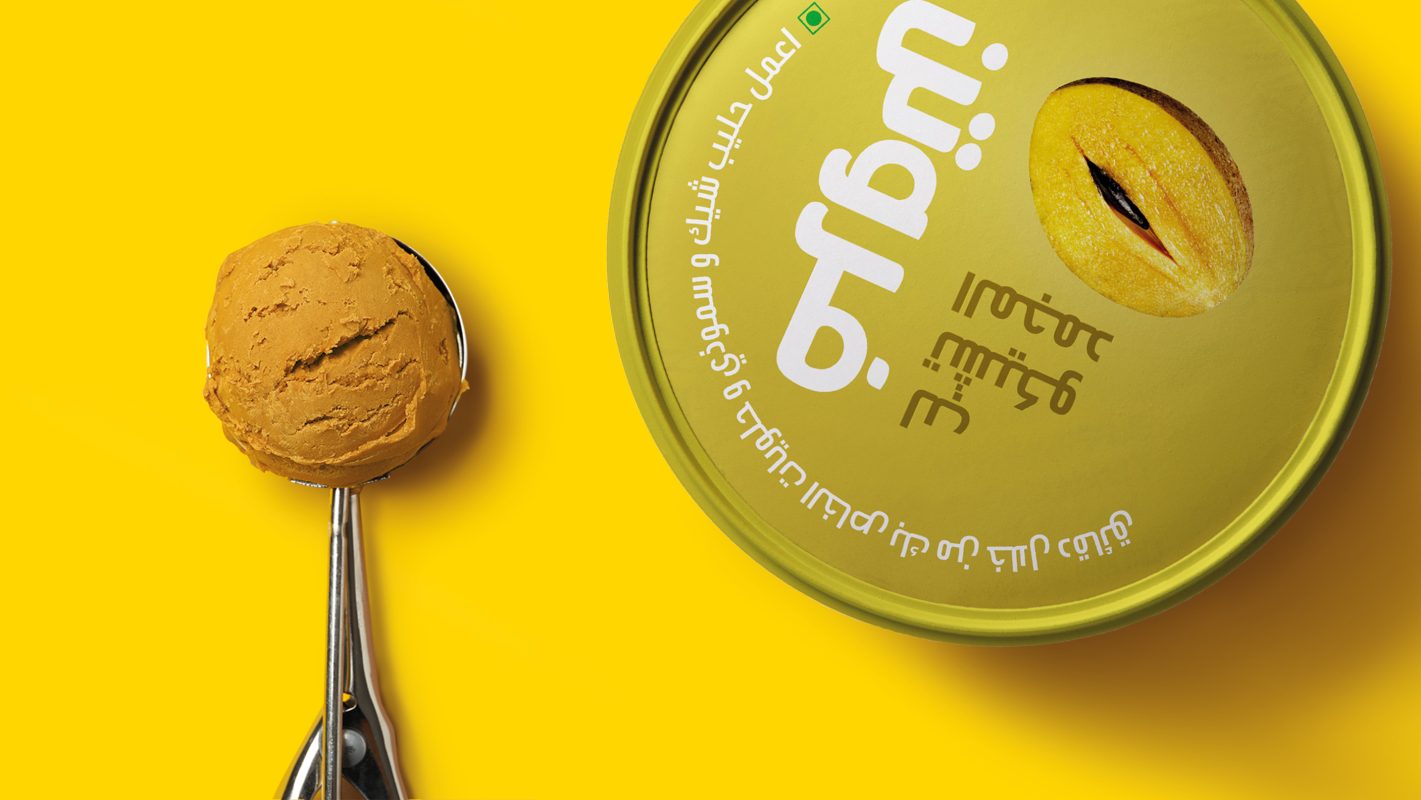
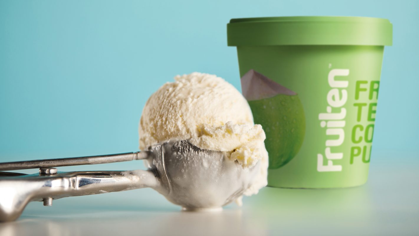
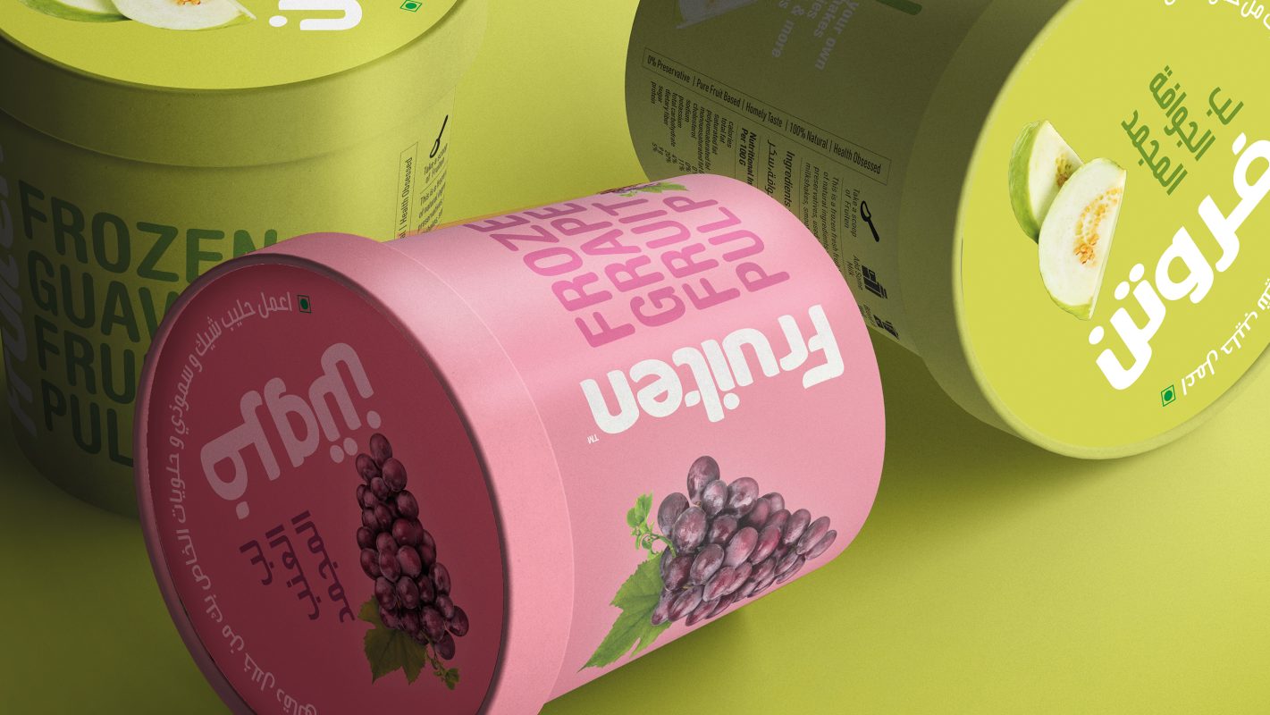
Less legibility and even less flavour identification elements made the previous package of the brand outdated. Scraping off the cluttered patterns in the old package design and the monotonous mauve colour, the new identity is captured in a fun wordmark designed to grab attention quickly and at the same time create an impulse buying temptation within consumers. The typography is slightly bubbly with pseudo-sharp ends and incorporates icons of a fruit and leaf in it. A rich coral red colour employed in this design completes the Fruiten effect by making the overall look pleasantly palatable. The uniqueness of each package, in different flavours, is displayed through picking pastel shades similar to the colour of the fruit used in the product, making the flavours easily distinguishable and in turn increasing the possibility of being picked from the shelves by the consumer.