The logo is a representation of this uniqueness. Understanding the power of a minimal design, the logo has been created with essentials that depict the essence of the brand. The structure of the squinch has been incorporated in a minimal way. The half finished tittle over the inverted ‘I’ stands for the structure of a dome over a square chamber. The logo is a representation of this uniqueness. Understanding the power of a minimal design, the logo has been created with essentials that depict the essence of the brand. The structure of the squinch has been incorporated in a minimal way. The half finished tittle over the inverted ‘I’ stands for the structure of a dome over a square chamber. The logo is a representation of this uniqueness. Understanding the power of a minimal design, the logo has been created with essentials that depict the essence of the brand.
The structure of the squinch has been incorporated in a minimal way. The half finished tittle over the inverted I stands for the structure of a dome over a square chamber. The logo is a representation of thislThe logo is a representation of this uniqueness. Understanding the power of a minimal design, the logo has been created with essentials that depict the essence of the brand. The structure of the squinch has been incorporated in a minimal way. The half finished tittle over the inverted ‘I’ stands for the structure of a dome over a square chamber. The logo is a representation of this uniqueness. Understanding the power of a minimal design, the logo has been created with essentials that depict the essence of the brand. The structure of the squinch has been incorporated in a minimal way. The half finished tittle over the inverted ‘I’ stands for the structure of a dome over a square chamber. The logo is a representation of this uniqueness. Understanding the power of a minimal design, the logo has been created with essentials that depict the essence of the brand.
The structure of the squinch has been incorporated in a minimal way. The half finished tittle over the inverted I stands for the structure of a dome over a square chamber. The logo is a representation of this.The logo is a representation of this uniqueness. Understanding the power of a minimal design, the logo has been created with essentials that depict the essence of the brand. The structure of the squinch has been incorporated in a minimal way. The half finished tittle over the inverted ‘I’ stands for the structure of a dome over a square chamber. The logo is a representation of this uniqueness. Understanding the power of a minimal design, the logo has been created with essentials that depict the essence of the brand. The structure of the squinch has been incorporated in a minimal way. The half finished tittle over the inverted ‘I’ stands for the structure of a dome over a square chamber. The logo is a representation of this uniqueness. Understanding the power of a minimal design, the logo has been created with essentials that depict the essence of the brand.
Kutiana
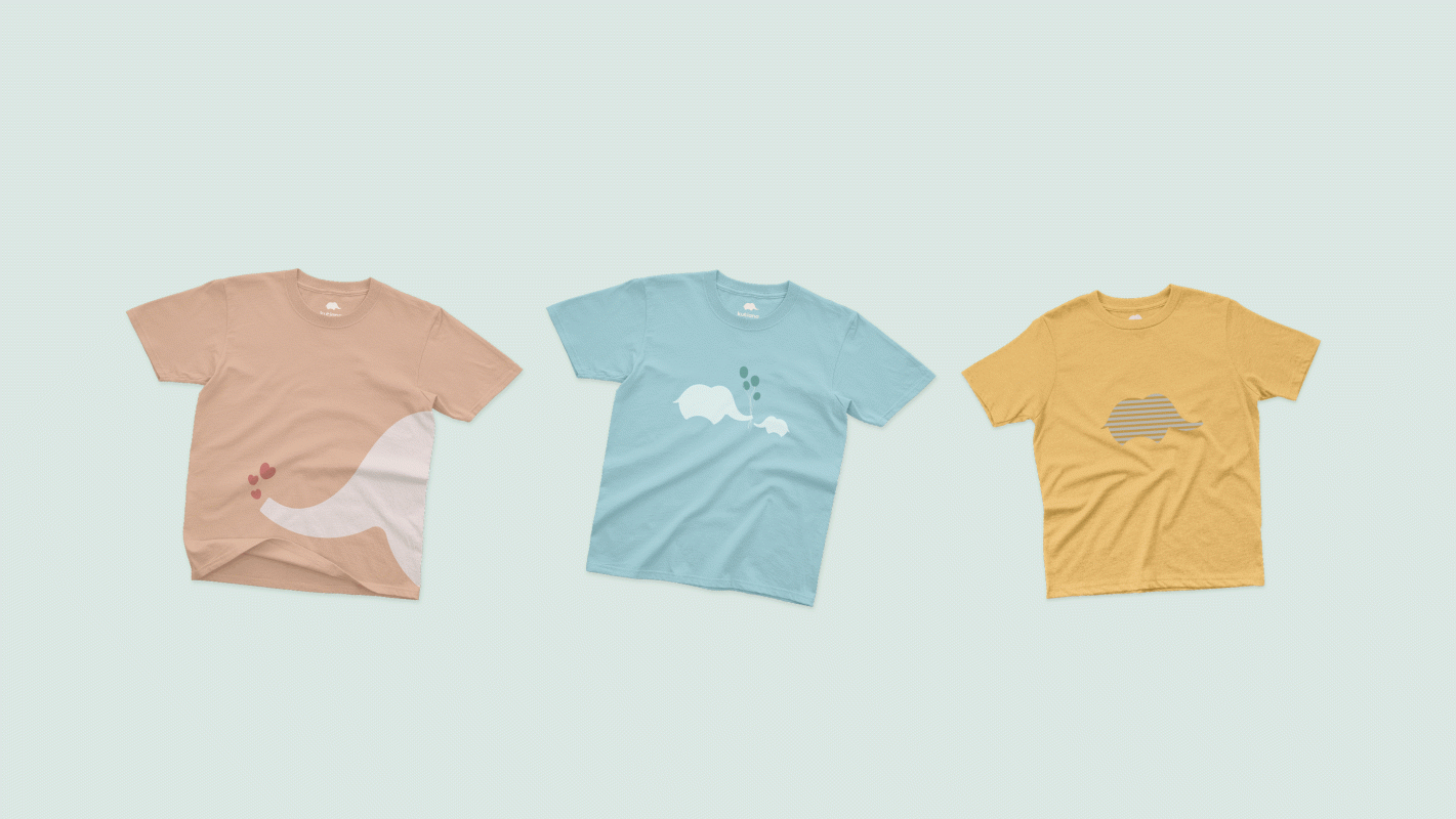
Kutiana, being a brand targeting children and young-age group, captures everything fun, enlightening and joyous. The identity for Kutiana consists of a logo symbolizing a baby elephant highlighting the meaning of the brand name along with a striking cheerful typography. The stand-alone icon can be well connected with children and is easily memorable leaving an impactful impression in the mind of the viewer.


