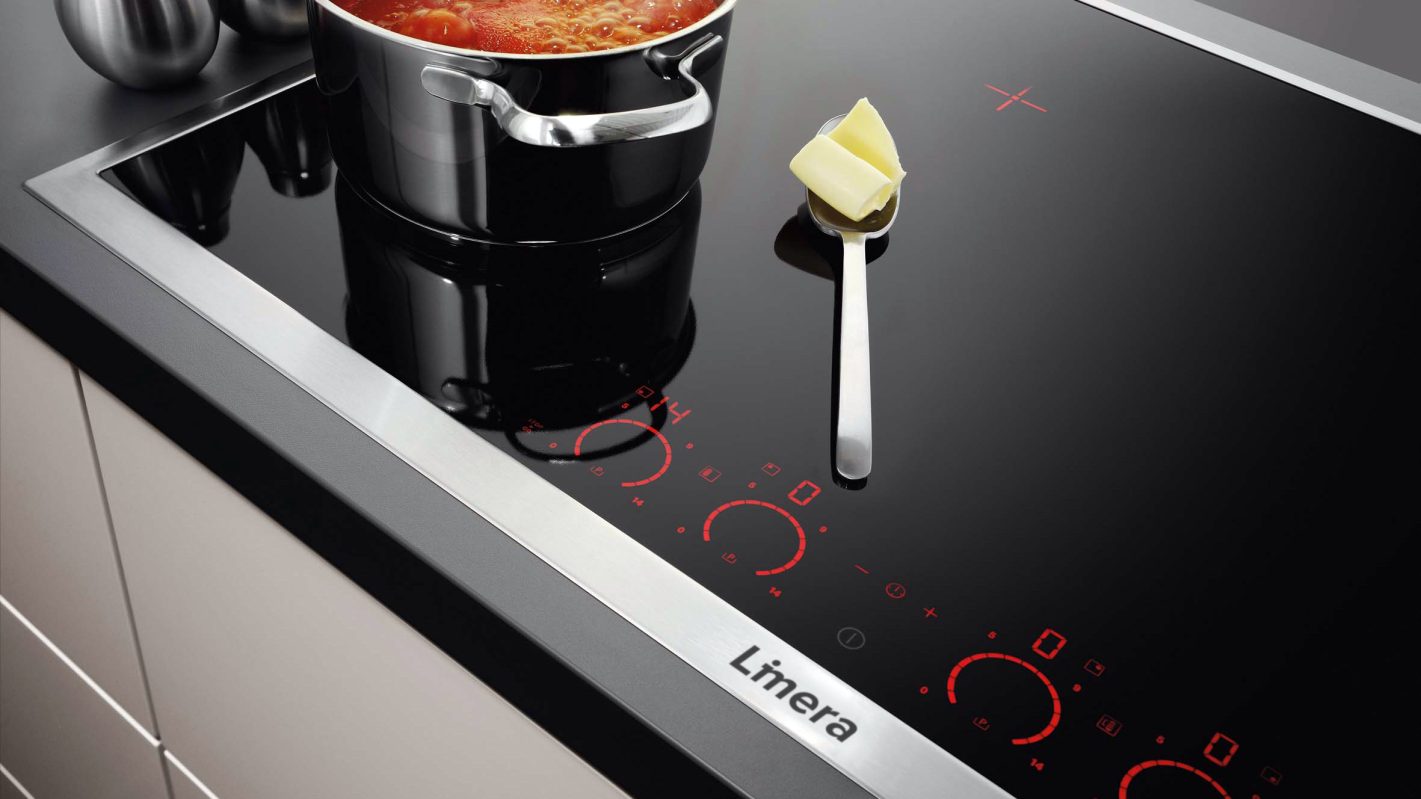
In crafting the brand identity for Limera, a trusted household brand offering essential products like pressure cookers, tawas, and kadais, we embarked on a creative journey to capture its reliability and importance in everyday life. Our process began with a deep dive into Limera's role in households and its reputation for dependable products.
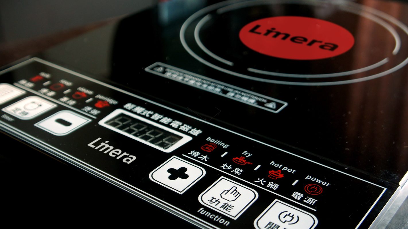
For the logo, we chose the color red as it symbolizes confidence, commands attention, and evokes a sense of urgency. This choice was deliberate, aligning with Limera's commitment to providing essential and reliable products that stand out in the household goods market.
Through the strategic use of red in the logo, our goal was to establish a visual identity that effectively communicates Limera's significance in the household goods sector. By carefully considering the impact of color psychology and Limera's brand positioning, we aimed to create a logo that not only captures the essence of Limera's reliability but also resonates with its audience, conveying a message of trust and importance in everyday life.