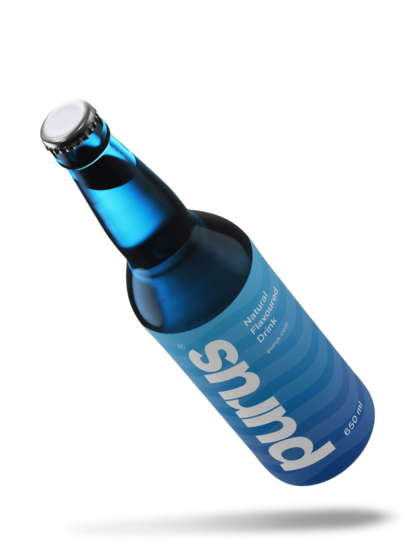
Emerging from a desire for balanced and pure living, Purus introduces itself as a brand-new purified water venture. "Purus" demanded a logo that speaks to its ethos– a brand of clarity and purity. The name Purus, chosen from the Latin word "pure” is a simple yet powerful etymology that serves as the cornerstone of their brand identity.
The logo visually represents the brand's core values. A custom-made sans-serif typeface is used, its crisp and clear font inspired by the Swiss style. This choice perfectly embodies the brand's focus on optimal clarity and purity.
The color palette draws inspiration from the soothing hues of blue created by light filtering through crystal-clear water. This shade of blue not only reflects the purity of the water itself but also resonates with the universally recognized symbolism of tranquility.