Iconic and eye-catchy identity design for a brand that creates naturally rich coconut-based products.
Long Content: Blending the richness of coconut with multiple health benefits, Robust is a brand that aims to bring hundred percent natural products in its finest form. This socially responsible brand converges their fresh and pure products with a sense of empowerment for coconut planters in Kerala. Having such a strong presence and ideology in their respective field, Yara’s team went for an equally remarkable identity design concept.
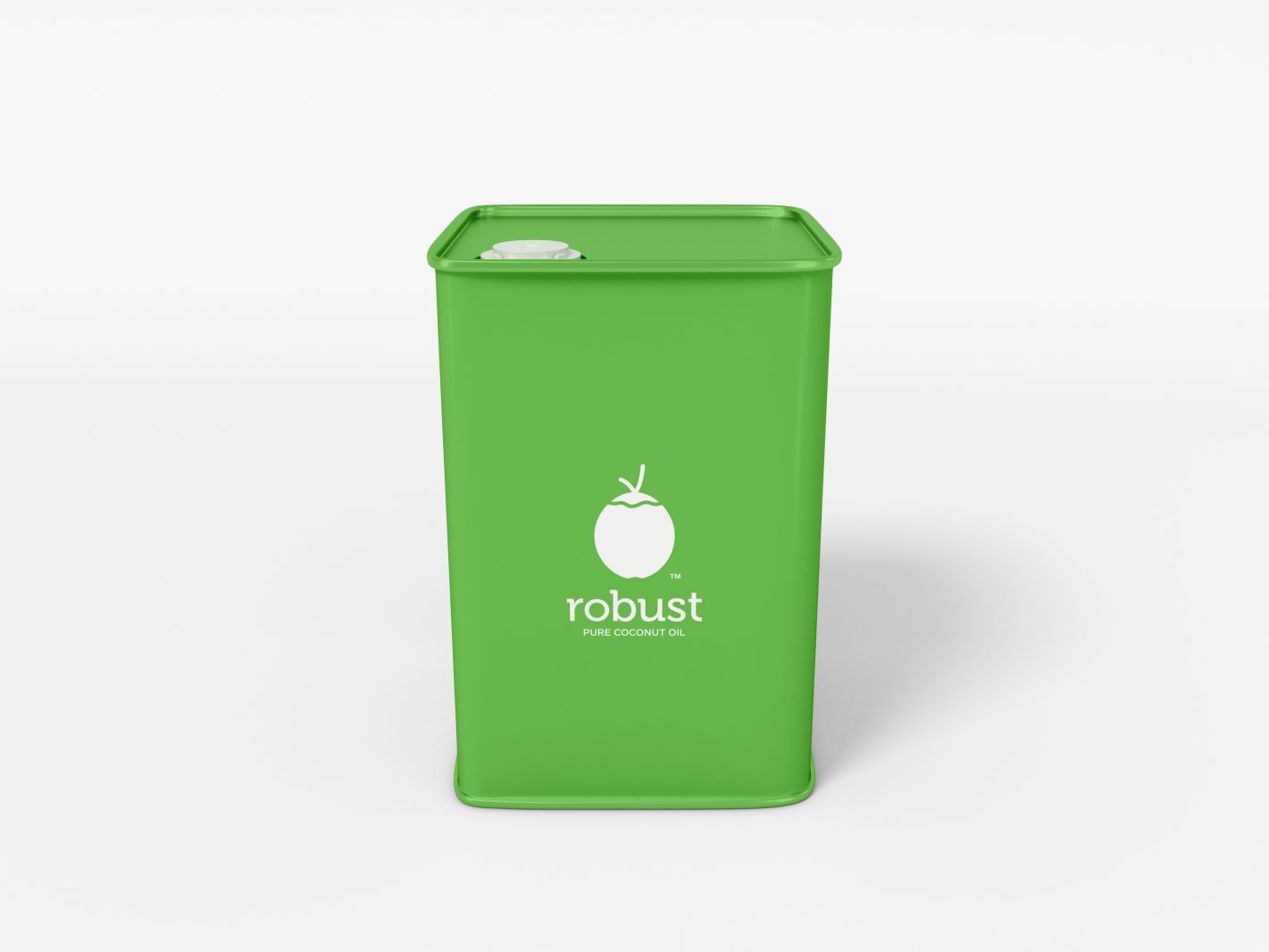
Taking inspiration from the harmonious asymmetry found in nature, the logo for Robust is a sole coconut silhouette portraying the main features of the brand. Detailing of this icon was avoided to create a flat look for the identity replacing the overly designed 3D shape, usually seen in packages and logos of South Asian based coconut product brands.
The bright Pantone 360C green colour, drawn right from a robust coconut, when paired with white details a sense of refreshment and renewal attached to the products. Accompanied by a minimally unique font, the overall character of the identity displays the contrary traits of the coconut - hard and soft, fluid and firm, and is sure to turn heads with its modern look.