For the premium resort shrouded by Wayanad greenery, naming and branding had to be rooted to its location while being minimal yet urban. There were numerous resorts and stays, located nearby, accommodating the phrases Vythiri, Village, Resorts, and our team wished to come up with a name that is easy on the tongue while being catchy at the same time. A combination of the site names, Vythiri and Wayanad, was ideated upon to concoct the name Vyna which sounded harmoniously pleasant.
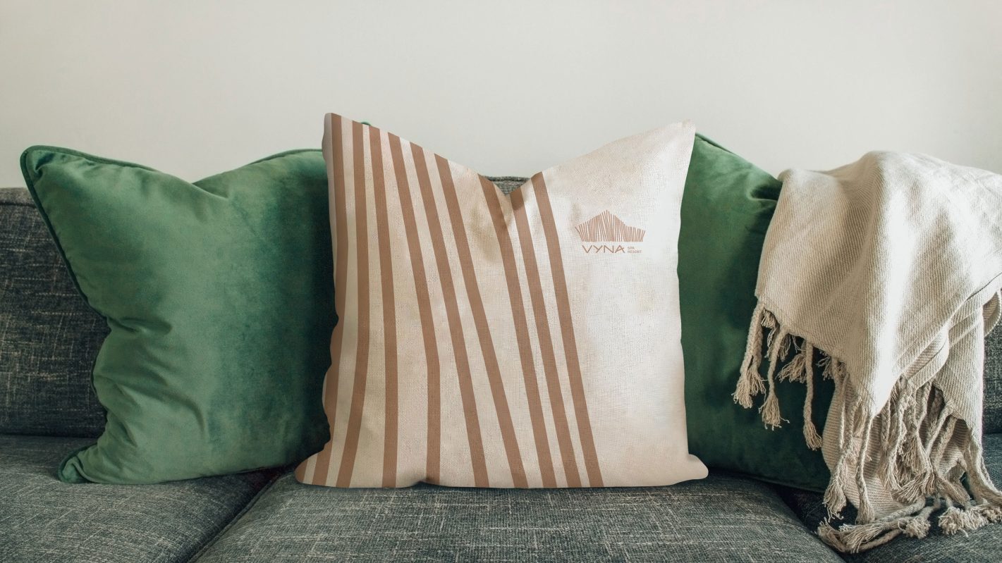
Identity design for the brand was created using basic geometrical elements of thick and thin lines inspired by patterns found in nature. The logo consists of an icon that represents the shape of the main resort building which was created by arranging these lines, and a uniquely constructed logomark.
Earthy tones of beige and brown forms the colour palette for Vyna, with the ability to evoke comfort, warmth and balance in any space. These shades are neutrally versatile and coordinates well with the surrounding greenery. As resorts produce miscellaneous products and toiletries with the brand identity, the overall icon in this colour scheme seems to help in maintaining the premium feel without losing quality.


