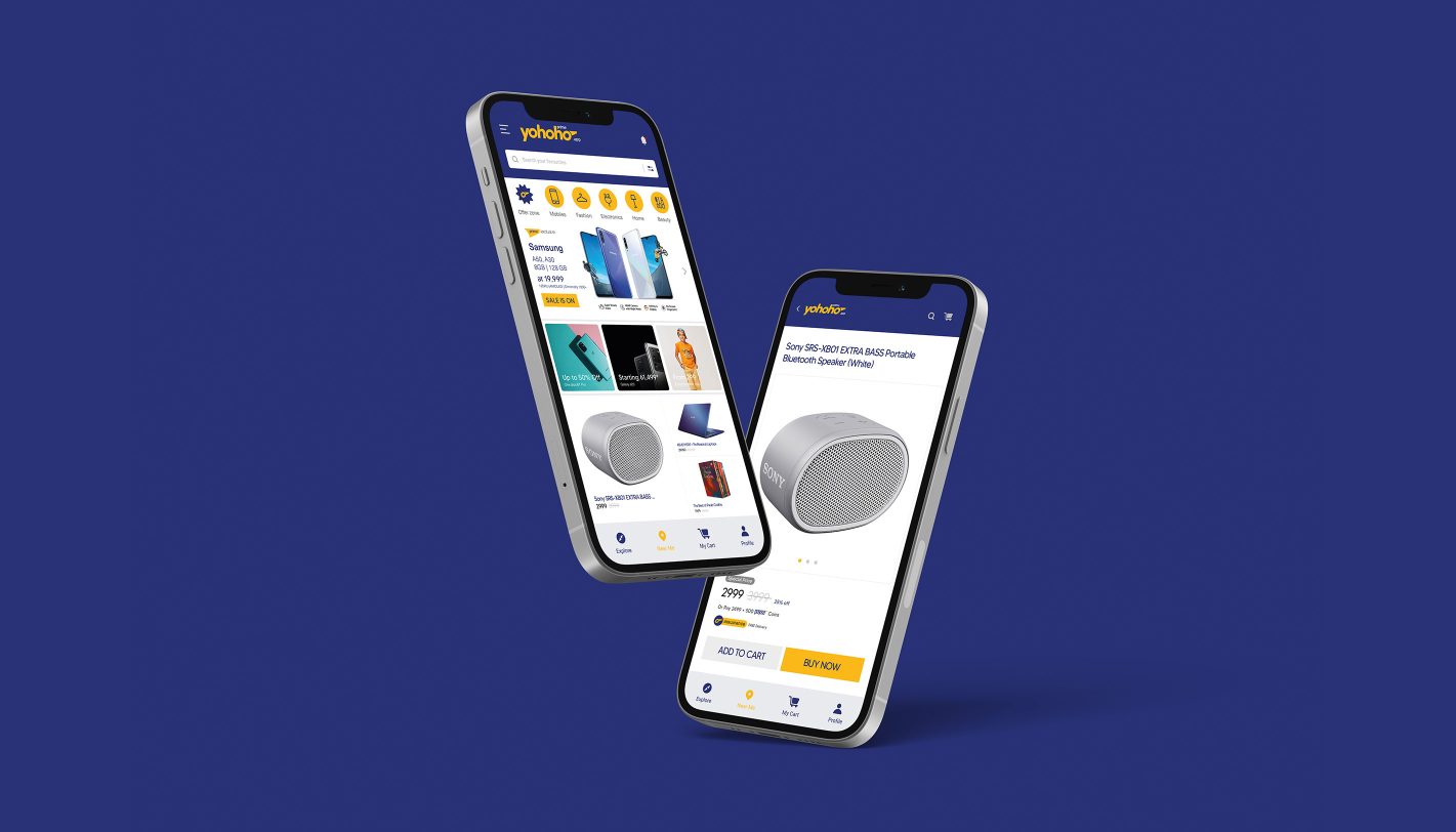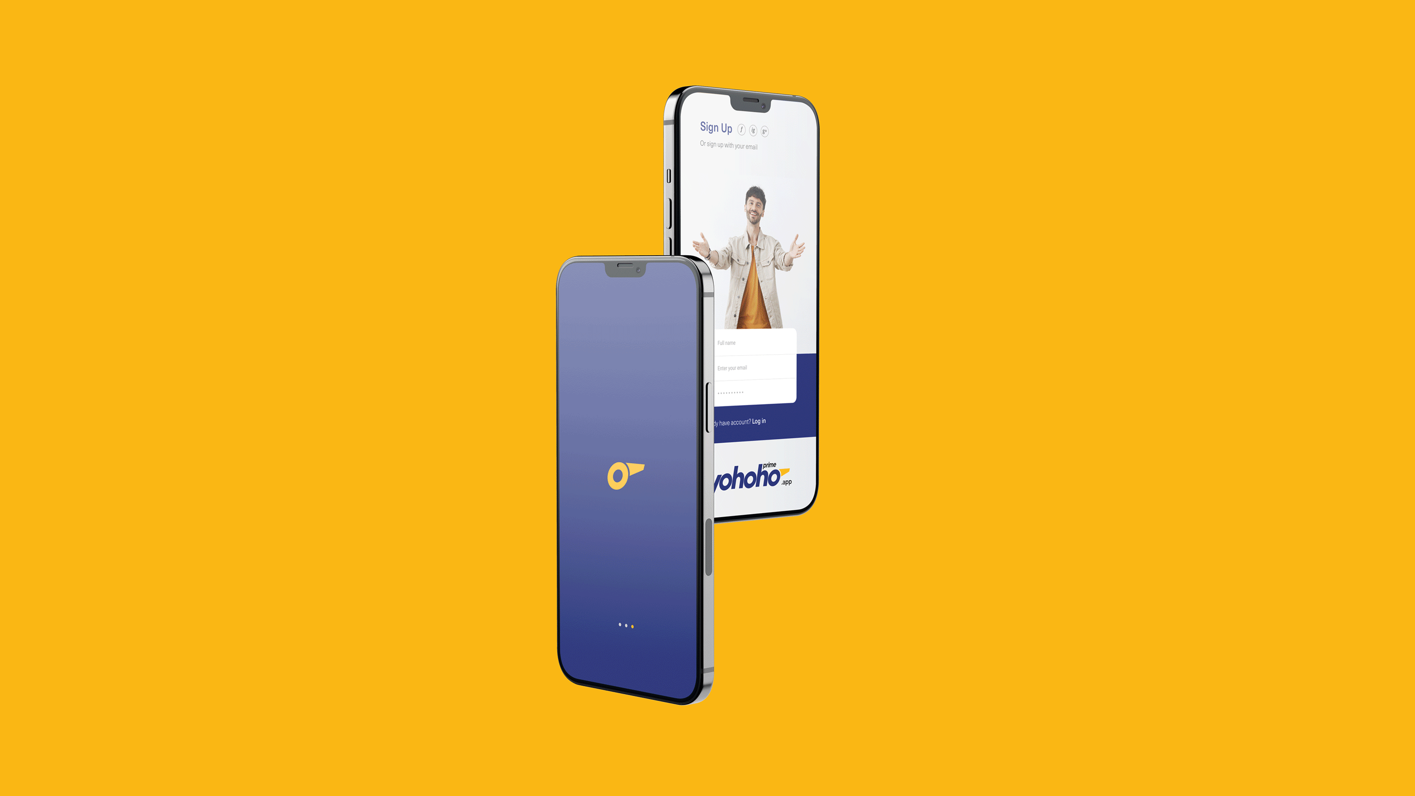
Creating the brand identity for Yohoho, an e-commerce platform, involved a strategic and creative approach that aimed to encapsulate its essence and appeal. Understanding the significance of "Yohoho" as both an exclamation and a nod to nautical communication was our starting point.
Our design process was inspired by the universal tool of signaling - the whistle. Transforming the letter 'o' into a minimalist whistle icon not only added a premium and sleek look to the logo but also established a unique visual identity for Yohoho.
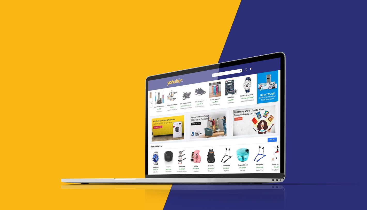
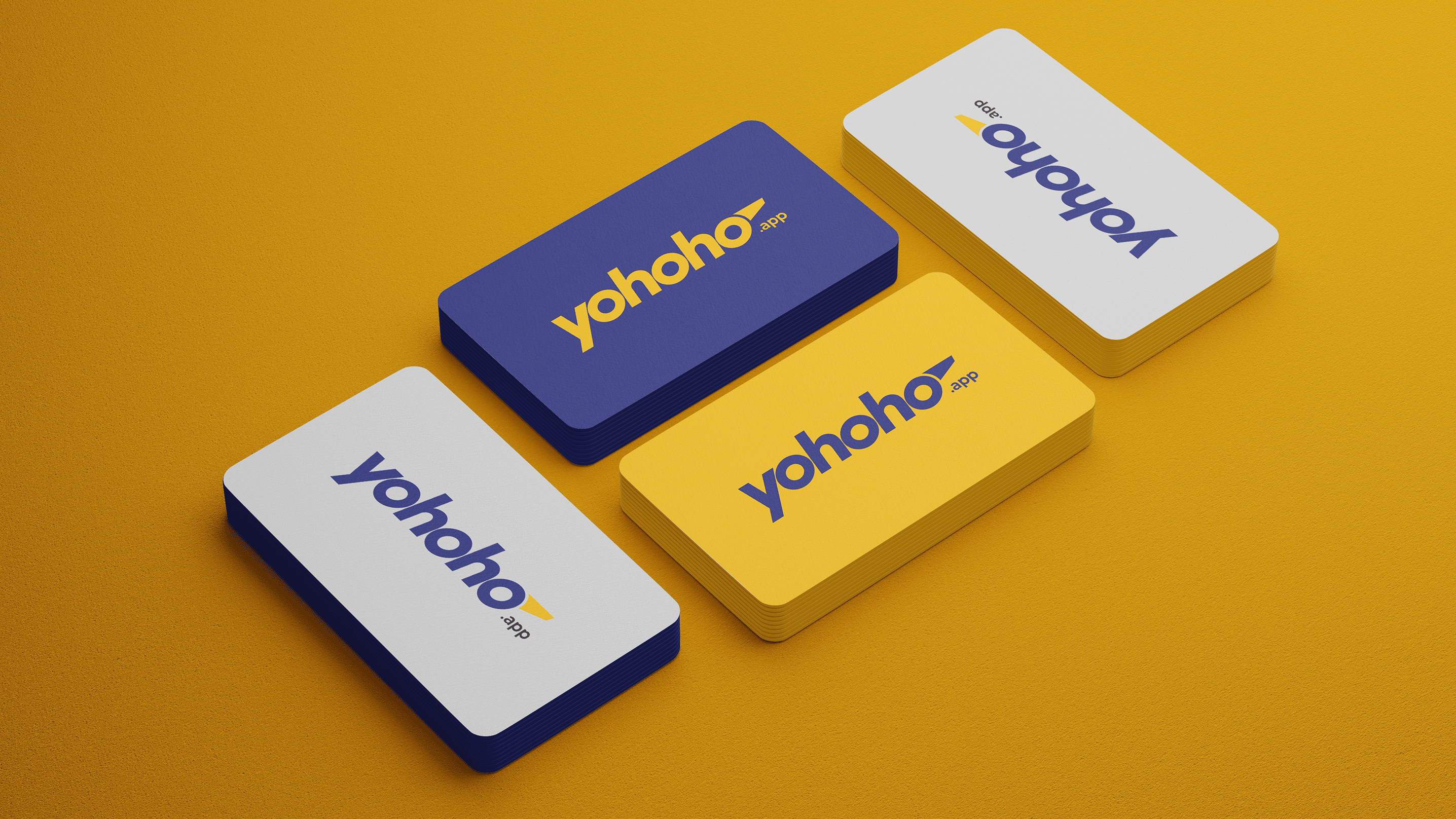
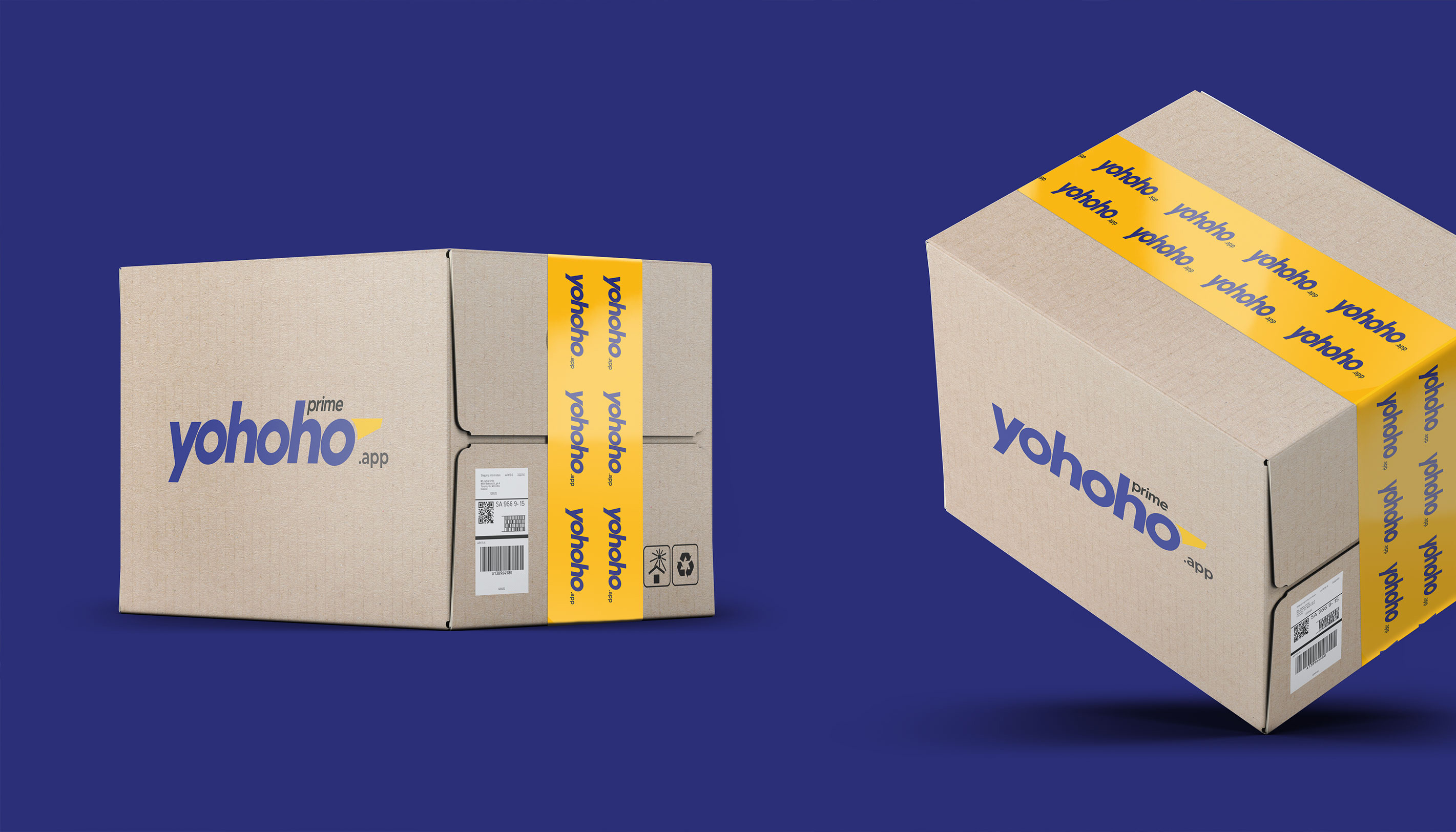
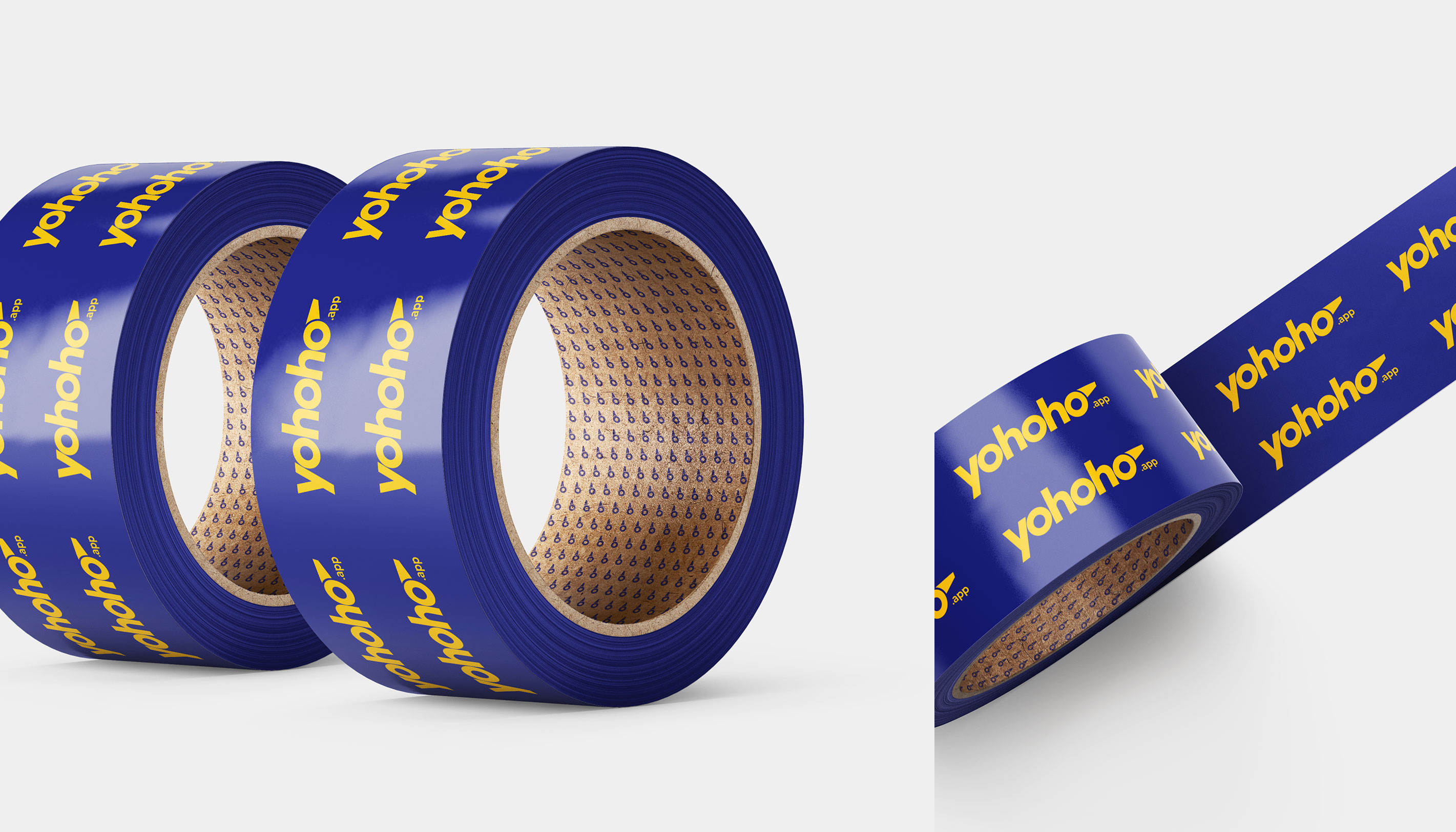
The choice of a royal purple-blue color was deliberate, representing creativity, grandeur, and power – qualities that resonate with the platform's essence. Complementing this with a catchy mustard yellow further added a sense of diversity, range, and fun, aligning with Yohoho's ethos of offering a wide array of products and an enjoyable shopping experience.
Through careful consideration of symbolism and color psychology, we crafted a distinctive brand identity that embodies Yohoho's values and invites attention while reflecting its vibrant and diverse offerings.