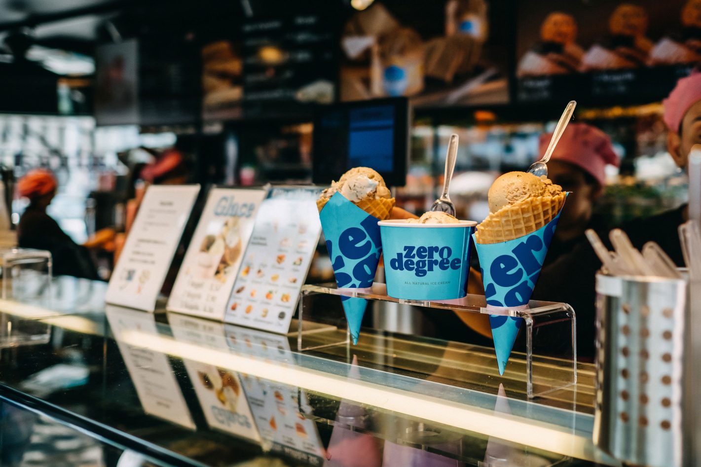
Crafting the brand identity for Zero Degree, a popular ice cream and ice lolly brand from Kerala, involved a creative process aimed at capturing the essence of its products. Our approach began with a thorough understanding of Zero Degree's market presence and its reputation for offering high-quality frozen treats.
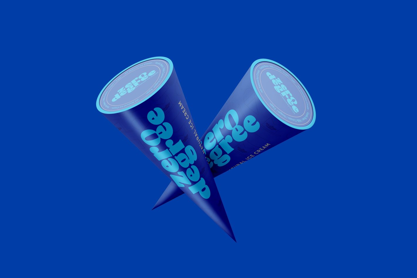
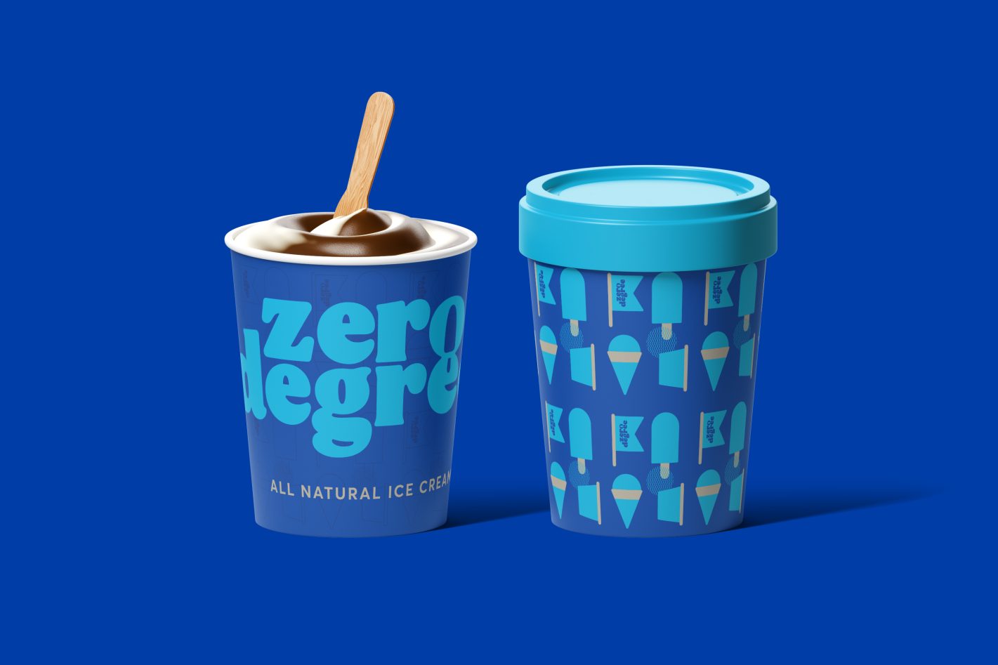
For the logo, we devised a clever graphic that incorporates an ice cream stick into the letters O and E, adding a playful yet recognizable element to the brand's name. This design choice aimed to visually represent Zero Degree's core products while creating a memorable and distinctive logo that would stand out in the competitive ice cream market.
The use of blue color in the logo was intentional, as it symbolizes cold temperatures, aligning with the brand's association with frozen desserts. This color choice evokes a sense of refreshment and coolness associated with enjoying ice cream. Through this strategic combination of design elements and color psychology, we aimed to create a cohesive brand identity that effectively communicates Zero Degree's commitment to quality and freshness in its frozen treats.