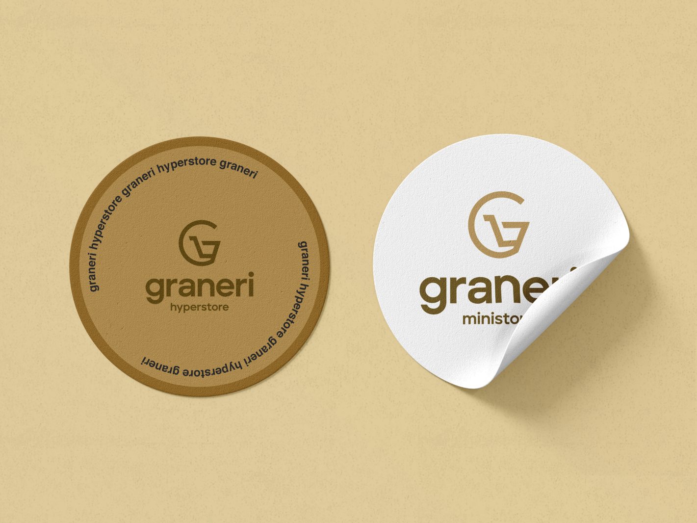
Our process began with understanding Graneri's vision of being a one-stop destination for both organic and inorganic products. For the logo, we conceptualized a design where the first letter "G" transforms into a shopping cart, symbolizing Graneri's role as a shopping destination. This creative concept not only represents the brand's name but also visually communicates its core purpose of providing a diverse array of products to its customers.
The choice of brown color in the logo was intentional, symbolizing the earth that holds both organic and inorganic items, aligning with Graneri's focus on offering a variety of products while being mindful of sustainability and nature.
By combining the graphical representation of the shopping cart with the earthy brown color, we aimed to create a logo that not only captures Graneri's essence but also resonates with its customers. Through this thoughtful approach to design, we sought to create a visual identity that reflects Graneri's values and reinforces its position as a reliable and comprehensive supermarket and grocery store in Kerala.


