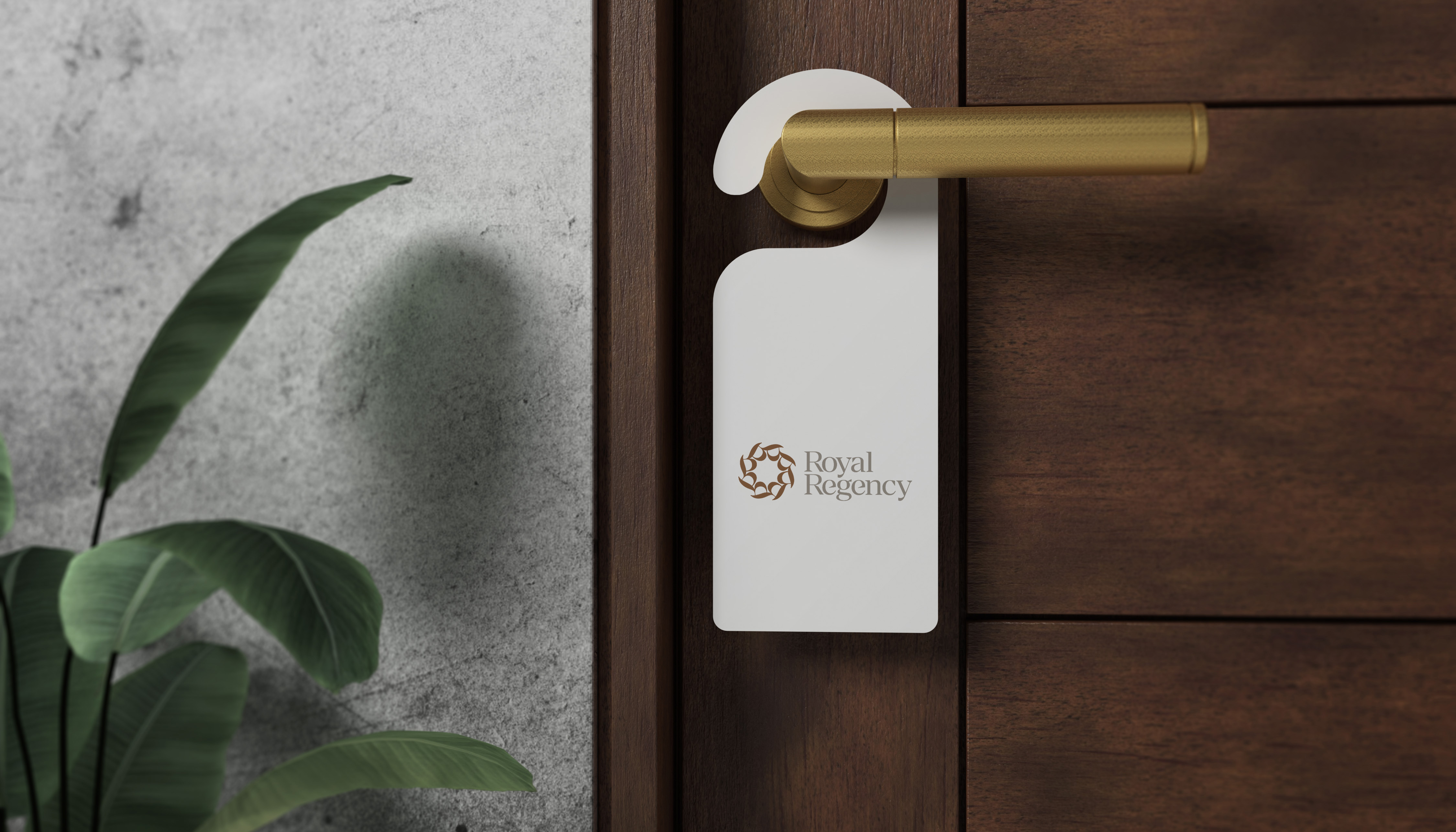
Brand Identity for the luxury hotel; The Royal Regency. The logo is a combination mark that reflects the essence of the Royal Regency Hotel, situated in the heart of Chennai, Tamil Nadu.
The typography in the logo is designed to be premium and sophisticated. The symbol is a clever play on the letters "R" from the Royal Regency. These letters are intertwined to form a circular crown-like pattern. This instantly evokes a sense of royalty and grandeur, reflecting the hotel's commitment to providing exceptional service and luxurious accommodations.
Brown is a natural choice for hospitality, often associated with luxury and richness.
It creates a sense of security and a welcoming atmosphere, perfect for a hotel. White, on the other hand, signifies purity and sophistication, further emphasizing the Royal Regency's dedication to providing a world-class experience.


